nustattools.plotting package
Module contents
Copyright (c) 2024 Lukas Koch. All rights reserved.
Potentially useful statistical tools that are not available in scipy.stats.
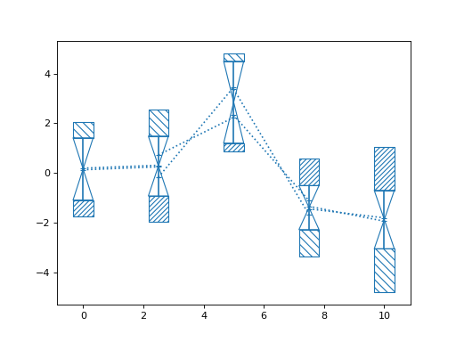
- nustattools.plotting.corlines(x, y, ycov, *, corlinestyle=':', cormarker='_', ax=None, **kwargs)[source]
Plot data points with error bars and correlation lines.
The correlation lines indicate the correlatio between neighbouring data points. They are attached to the vertical error bars at a relative height corresponding to the correlation coefficient between the data points. For positive correlations, they are attached on the same sides, for negative correlation at opposing sides.
- Parameters:
x (numpy.ndarray) – The data x and y coordinates to be plotted.
y (numpy.ndarray) – The data x and y coordinates to be plotted.
ycov (numpy.ndarray) – The covariance matrix describing the uncertainties of the y-values. The error bars will correspond the the square root of the diagonal entries.
corlinestyle (str, default=":") – The Matplotlib linestyle for the correlation lines.
cormarker (str, default="_") – The Matplotlib marker used where the correlation lines attach to the vertical error bars.
ax (matplotlib.axes.Axes, optional) – Axes object to plot onto
**kwargs (dict, optional) – All other keyword arguments are passed to
matplotlib.axes.Axes.errorbar()
- Returns:
The return value of the
matplotlib.axes.Axes.errorbar()method.- Return type:
Notes
Where the correlation lines attach to the vertical error bars, gives an indication of how much of the variance in the given data point is “caused” by the neighbouring data points. Also, if the value of the neighbouring data point is fixed to plus or minus 1 sigma away from its mean position, the mean of the given data point is shifted to the position where the correlation line attaches. Of course, this is a symmetric relationship and the “fixing” and “causing” can equally be read in the opposite direction.
Examples
Basic usage:
>>> import numpy as np
>>> from matplotlib import pyplot as plt
>>> from nustattools import plotting as nuplt
>>> rng = np.random.default_rng()
>>> x = np.linspace(0, 10, 5)
>>> u = x[:,np.newaxis] / 4
>>> u[-2] *= -1
>>> cov = np.eye(5) + u@u.T
>>> y = rng.multivariate_normal(np.zeros(5), cov)
>>> nuplt.corlines(x, y, cov, marker="x")
(
Source code,png,hires.png,pdf)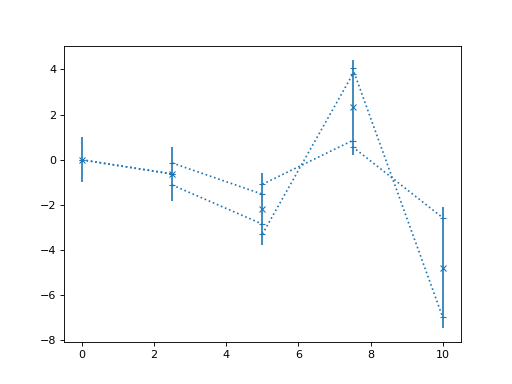
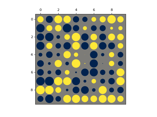
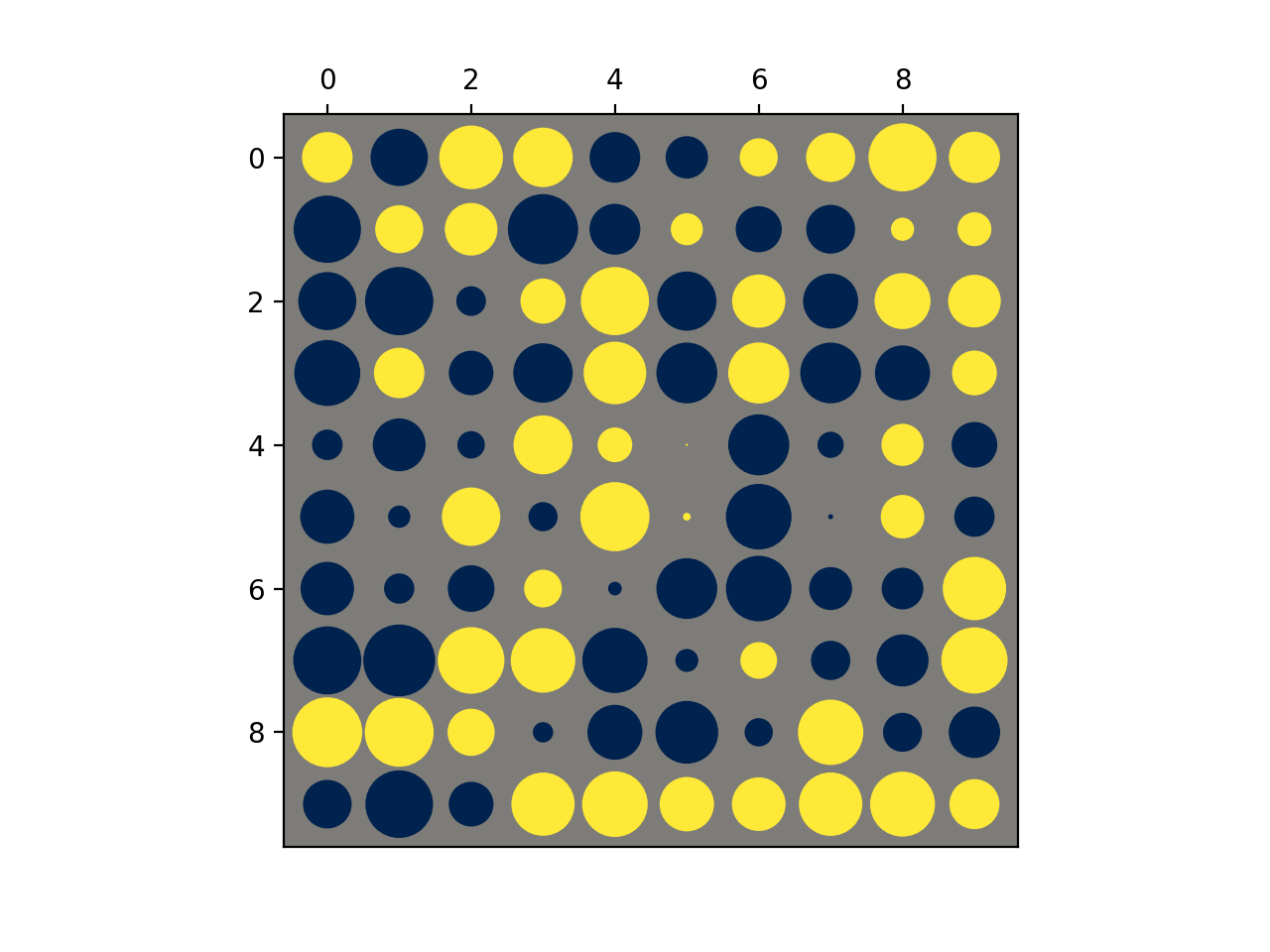
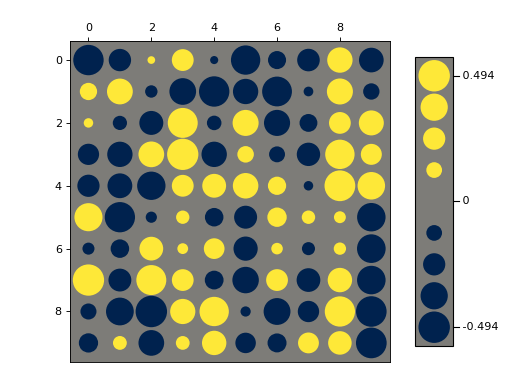
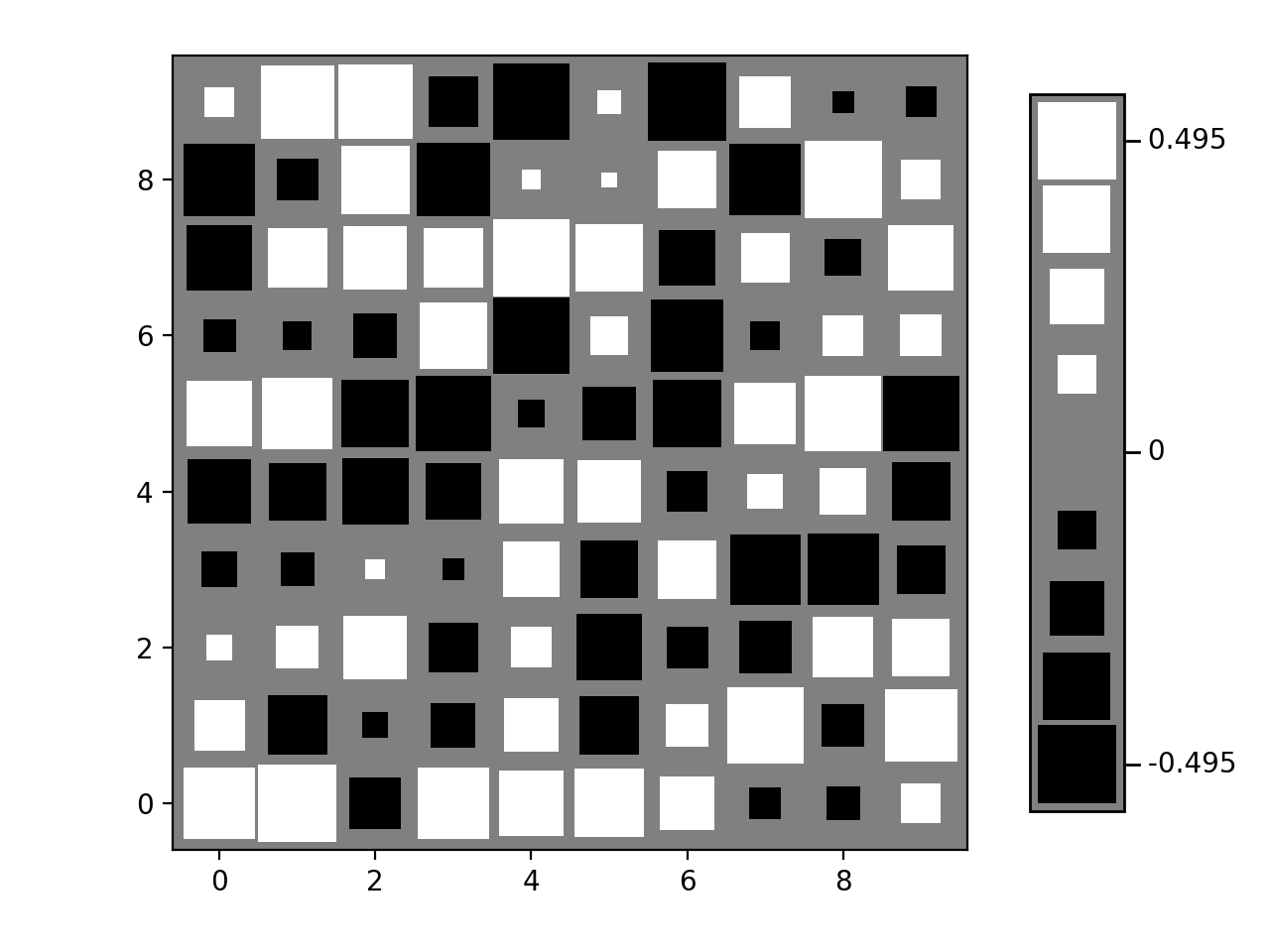
- nustattools.plotting.hinton(matrix, *, vmax=None, shape='circle', origin='upper', cmap='cividis', legend=False, ax=None)[source]
Draw Hinton diagram for visualizing a matrix with positive and negative values.
- Parameters:
matrix (numpy.ndarray) – The matrix to be visualized.
vmax (float, optional) – The upper limit of the value scale. -vmax will be used as the lower limit. Defaults to being inferred from the data.
shape (str, default="circle") – Either “circle” or “square”. The shape of the symbols representing the matrix elements.
origin (str, default="upper") – Either “upper” or “lower”. Where to put the 1st element of the 1st axis.
cmap (str, default="cividis") – The Matplotlib colormap to take the colors from. Should be perceptually uniform sequantial.
legend (bool, default=False) – Draw a “legend” to the side of the plot, showing the range of values.
ax (matplotlib.axes.Axes, optional) – Axes object to plot onto
- Returns:
col0, col1 – The collections of patches for the negative and positive colors respectively
- Return type:
Examples
Basic usage:
>>> import numpy as np
>>> from matplotlib import pyplot as plt
>>> from nustattools import plotting as nuplt
>>> rng = np.random.default_rng()
>>> M = rng.uniform(size=(10,10)) - 0.5
>>> nuplt.hinton(M)
(
Source code,png,hires.png,pdf)
Plot with a legend:
>>> import numpy as np
>>> from matplotlib import pyplot as plt
>>> from nustattools import plotting as nuplt
>>> rng = np.random.default_rng()
>>> M = rng.uniform(size=(10,10)) - 0.5
>>> nuplt.hinton(M, legend=True)
>>> plt.tight_layout(pad=2)
(
Source code,png,hires.png,pdf)
Variants:
>>> import numpy as np
>>> from matplotlib import pyplot as plt
>>> from nustattools import plotting as nuplt
>>> rng = np.random.default_rng()
>>> M = rng.uniform(size=(10,10)) - 0.5
>>> nuplt.hinton(M, legend=True, shape="square", cmap="gray", origin="lower")
>>> plt.tight_layout(pad=2)
(
Source code,png,hires.png,pdf)
Notes
Based on https://matplotlib.org/stable/gallery/specialty_plots/hinton_demo.html
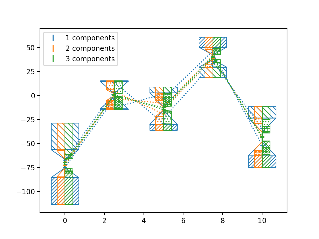
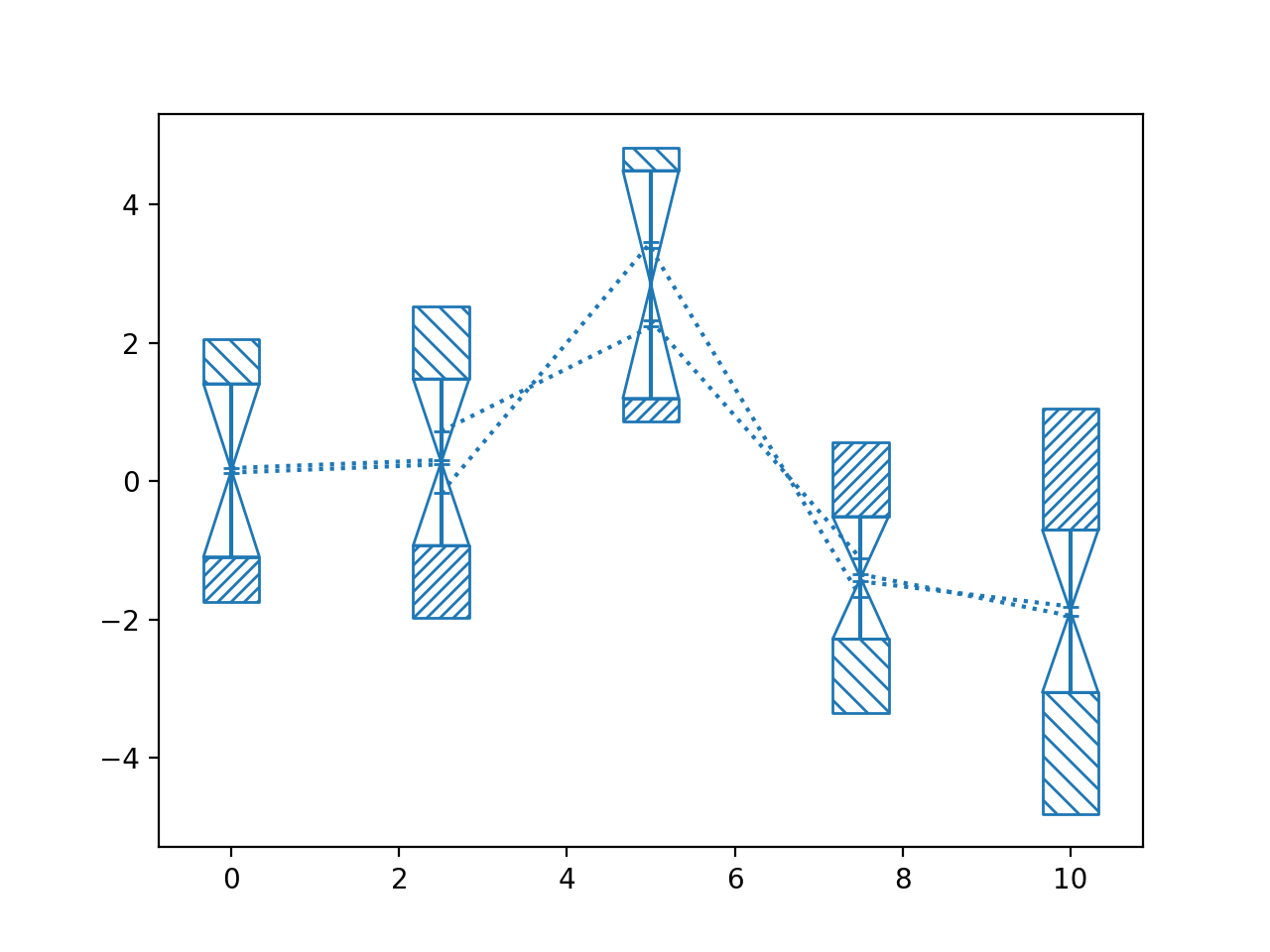
- nustattools.plotting.pcplot(x, y, ycov, *, componentwidth=None, components=0.5, target_quantile=0.5, hatch=None, drawcorlines=True, drawconditional=True, normalize=True, ax=None, label_components=False, return_dict=None, **kwargs)[source]
Plot data points with 1st PCA component and correlation lines.
The contribution of the first principal component is subtracted from the covariance and the remainder plotted with
corlines(). Then the difference to the full covariance matrix is plotted with the type of infill indicating the direction of the first principal component.- Parameters:
x (numpy.ndarray) – The data x and y coordinates to be plotted.
y (numpy.ndarray) – The data x and y coordinates to be plotted.
ycov (numpy.ndarray) – The covariance matrix describing the uncertainties of the y-values. The error bars will correspond the the square root of the diagonal entries.
componentwidth (optional) – The width of the hatched areas indicating the 1st principal component in axes coordinates. Can be a single number, so it is equal for all data points; an iterable of numbers so it is different for each, or an iterable of pairs of numbers, so there is an asymmetric width for each.
components (int or float, default=0.5) – How many components to show. If set to a
float, the number of components is set to cover the requested fraction of the total covariance. Cannot exceed the number of defined hatch styles.target_quantile (float, default=0.5) – Determines the scaling of the components to be removed and plotted separately. The target is chose as the given quantile of the original principal components. If the target is larger than the first untouched component (e.g. the 3rd componend when 2 components are plotted), the value of that untouched component is chosen as target.
hatch (list of tuple of str, optional) – The Matplotlib hatch styles for the positive and negative directions of the principal components.
drawcorlines (default=True) – Whether to draw correlation lines of the remaining covariance.
drawconditional (default=True) – Whether to draw the conditional uncertainty of each data point, i.e. the allowed variance if all other points are fixed.
normalize (default=True) – If
True, the covariance is scaled such that all diagonals are 1, and the PCA is run on the correlation matrix. IfFalse, the PCA is run on the covariance matrix directly. In the latter case, different error scales for different data points will have a strong influence on the selection of the components.ax (matplotlib.axes.Axes, optional) – Axes object to plot onto
label_components (default=False) – Whether to add labels to the principal components.
return_dict (dict, optional) – Dictionary to store some of the intermediary steps of the covariance decompositions.
**kwargs (dict, optional) – All other keyword arguments are passed to
corlines()
- Return type:
- Returns:
matplotlib.container.ErrorbarContainer – The return value of the
corlines()function.
Notes
This plotting style is most useful for data where the first one or two principal components dominate the covariance of the data.
The algorithm for plotting is as follows:
Calculate the principal components.
This is done by doing a Single Value Decomposition of the covariance matrix. If normalize is
True, the corresponding correlation matrix is used instead.
Determine the number principal components to be shown,
N_pc.If an integer number is provided, this number is used
Otherwise the number is chosen so that those components together cover the provided fraction of the total covariance, i.e. the sum of singular values. Higher numbers mean more components.
Determine the amount of each component that will be removed.
Removing 100% of the principal components would make the remaining covariance matrix degenerate and thus strongly correlated. The aim is to make the plot of the remainder _less_ correlated, so the removed components need to be scaled down.
The scaling of the components is done so that the singular values of the first
N_pccomponents after the subtraction are equal to the target value.The target value is the specified quantile of the original singular values of the covariance matrix.
If the target value is larger (i.e. less subtraction) than the
N_px+1-th singular value, it is set to that value. So after the subtraction, all singular values will be no bigger than of the largest untouched principal component.
Subtract the scaled contributions of the first
N_pcprincipal components. The remaining covariance is calledK.Plot the data with covariance
Kusingcorlines().From smallest to largest, add the contribution of the subtracted principal components again. Plot the difference to the error bars of the previous covariance as hatched boxes.
If requested, determine the conditional uncertainty of each data point and plot those as wedges from the error bars of
Kpointing to the conditional uncertainties.
Examples
Basic usage:
>>> import numpy as np
>>> from matplotlib import pyplot as plt
>>> from nustattools import plotting as nuplt
>>> rng = np.random.default_rng()
>>> x = np.linspace(0, 10, 5)
>>> cov = np.eye(5)
>>> u = x[:,np.newaxis] / 4
>>> for i in range(3):
>>>     u[i] *= -1
>>>     cov = cov + u@u.T
>>> y = rng.multivariate_normal(np.zeros(5), cov)
>>> nuplt.pcplot(x, y, cov, marker="x")
(
Source code,png,hires.png,pdf)
Compare number of components:
>>> import numpy as np
>>> from matplotlib import pyplot as plt
>>> from nustattools import plotting as nuplt
>>> rng = np.random.default_rng()
>>> x = np.linspace(0, 10, 5)
>>> cov = np.eye(5)
>>> u = x[:,np.newaxis] / 4
>>> for i in range(4):
>>>     u *= 2
>>>     u[0] *= -1
>>>     cov = cov + u@u.T
>>>     u = np.roll(u, i+1)
>>> y = rng.multivariate_normal(np.zeros(5), cov)
>>> nuplt.pcplot(x, y, cov, componentwidth=1.4, components=1, label="1 components")
>>> nuplt.pcplot(x, y, cov, componentwidth=[(0.4,0)], components=2, label="2 components")
>>> nuplt.pcplot(x, y, cov, componentwidth=[(0,0.4)], components=3, label="3 components")
>>> plt.legend()
(
Source code,png,hires.png,pdf)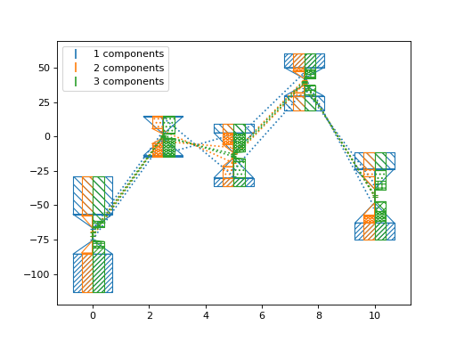
Rank deficient covariance:
>>> import numpy as np
>>> from matplotlib import pyplot as plt
>>> from nustattools import plotting as nuplt
>>> rng = np.random.default_rng()
>>> x = np.linspace(0, 10, 5)
>>> cov = np.eye(5)
>>> u = x[:,np.newaxis] / 4
>>> for i in range(3):
>>>     u[i] *= -1
>>>     cov = cov + u@u.T
>>> # Matrix to project to constant sum of data points
>>> A = np.eye(5) - np.ones((5,5)) * 1/5
>>> cov = A @ cov @ A.T
>>> y = rng.multivariate_normal(np.zeros(5), cov)
>>> nuplt.pcplot(x, y, cov)
(
Source code,png,hires.png,pdf)
See also
corlinesPlotting function for the remaining covariance
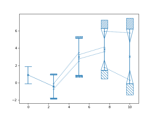
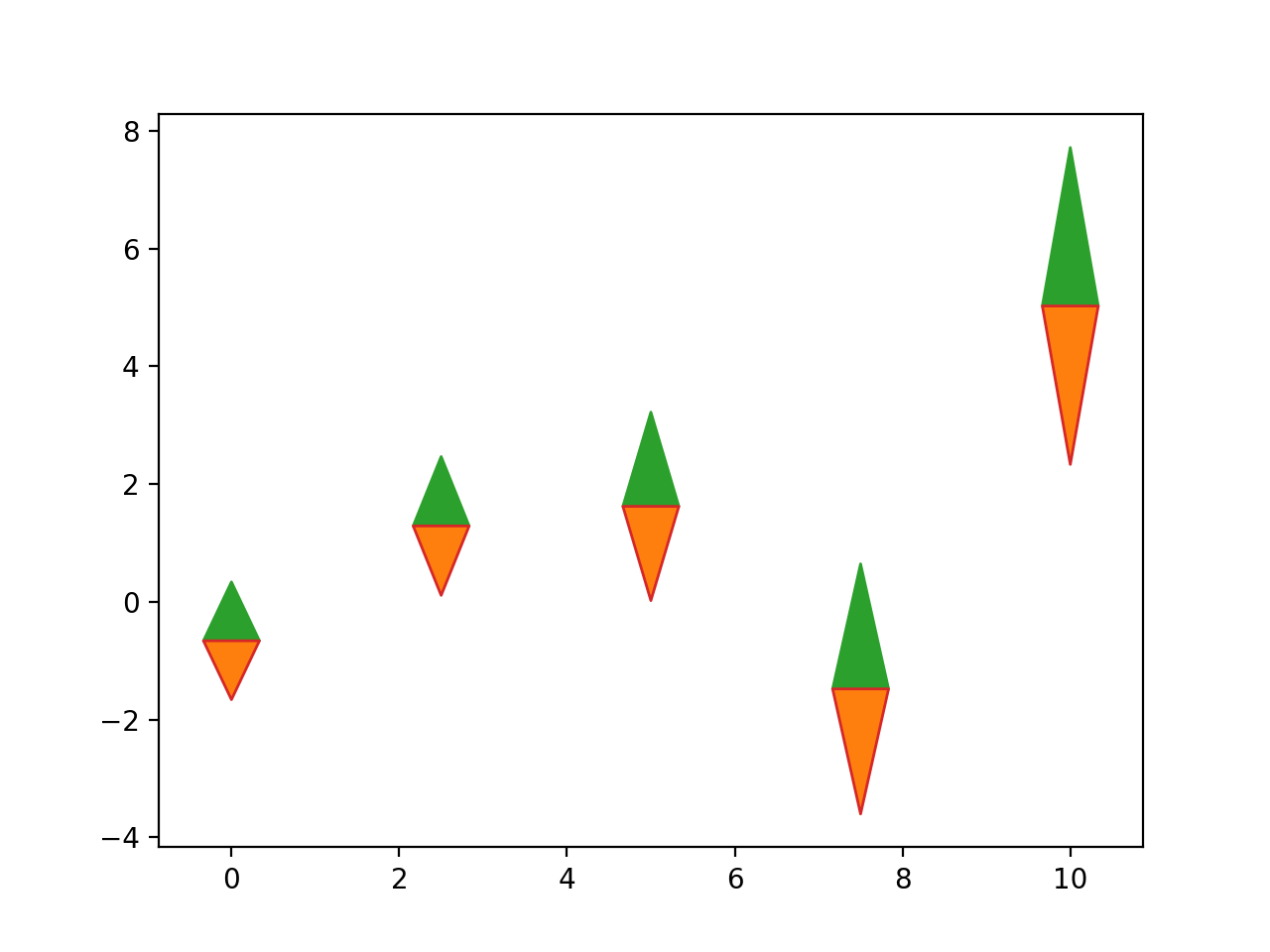
- nustattools.plotting.wedgeplot(x, y, dy, *, wedgewidth=None, ax=None, **kwargs)[source]
Plot vertical wedges at the given data points with the given lengths.
- Parameters:
x (numpy.ndarray) – The data x and y coordinates and length of the wedges to be plotted.
y (numpy.ndarray) – The data x and y coordinates and length of the wedges to be plotted.
dy (numpy.ndarray) – The data x and y coordinates and length of the wedges to be plotted.
wedgewidth (optional) – The width of the wedges in axes coordinates. Can be a single number, so it is equal for all data points; an iterable of numbers so it is different for each, or an iterable of pairs of numbers, so there is an asymmetric width for each.
ax (matplotlib.axes.Axes, optional) – Axes object to plot onto
**kwargs (dict, optional) – All other keyword arguments are passed to
matplotlib.collections.PolyCollection
- Return type:
Examples
Basic usage:
>>> import numpy as np
>>> from matplotlib import pyplot as plt
>>> from nustattools import plotting as nuplt
>>> rng = np.random.default_rng()
>>> x = np.linspace(0, 10, 5)
>>> u = x[:,np.newaxis] / 4
>>> u[-2] *= -1
>>> cov = np.eye(5) + u@u.T
>>> err = np.sqrt(np.diag(cov))
>>> y = rng.multivariate_normal(np.zeros(5), cov)
>>> up = nuplt.wedgeplot(x, y, err, color="C2")
>>> down = nuplt.wedgeplot(x, y, -err, color="C3")
>>> down.set_facecolor("C1")
(
Source code,png,hires.png,pdf)