nustattools.plotting package
Module contents
Copyright (c) 2024 Lukas Koch. All rights reserved.
Potentially useful statistical tools that are not available in scipy.stats.
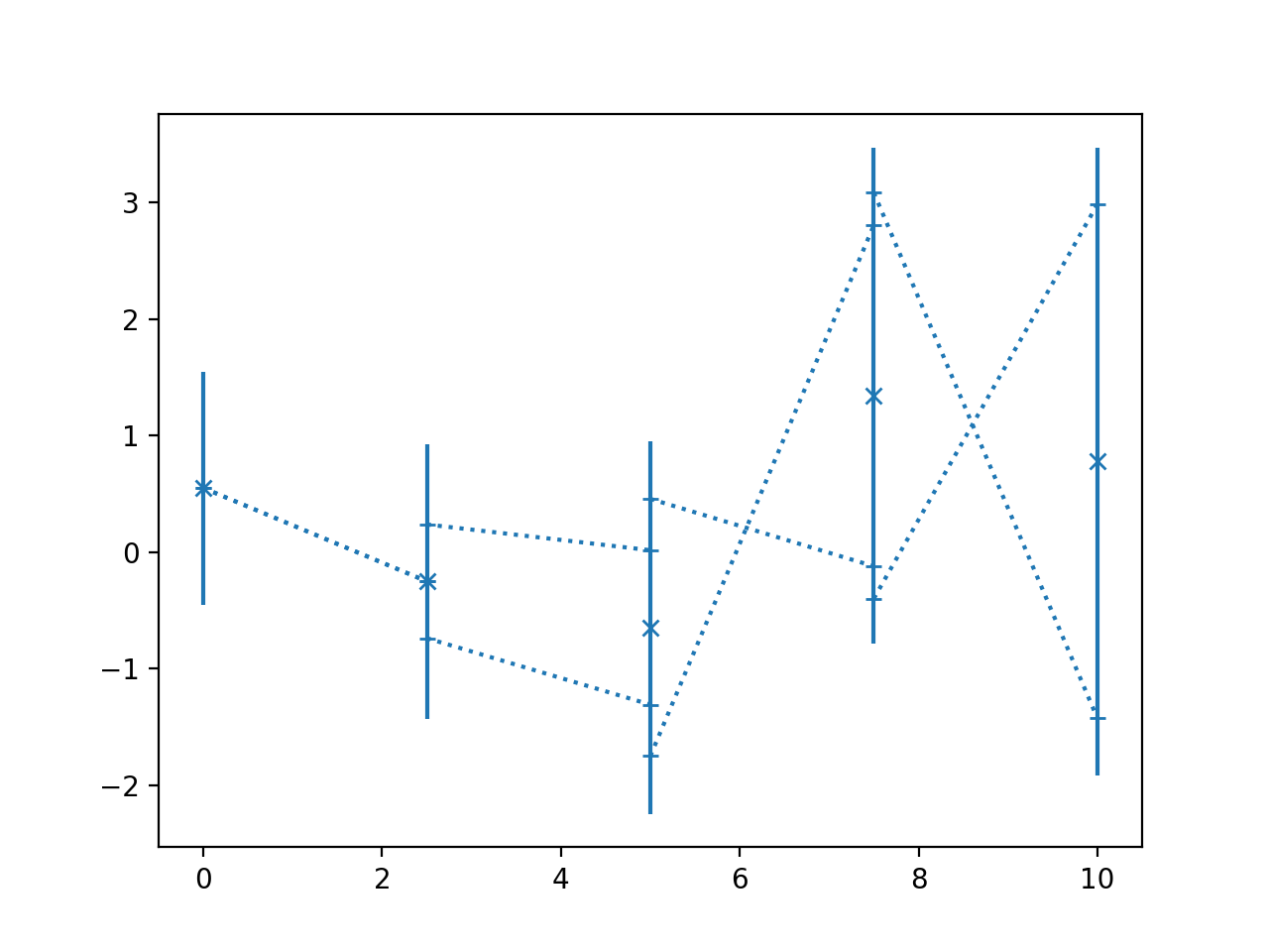
- nustattools.plotting.corlines(x, y, ycov, *, corlinestyle=':', cormarker='_', ax=None, **kwargs)[source]
Plot data points with error bars and correlation lines.
The correlation lines indicate the correlatio between neighbouring data points. They are attached to the vertical error bars at a relative height corresponding to the correlation coefficient between the data points. For positive correlations, they are attached on the same sides, for negative correlation at opposing sides.
- Parameters:
x (numpy.ndarray) – The data x and y coordinates to be plotted.
y (numpy.ndarray) – The data x and y coordinates to be plotted.
ycov (numpy.ndarray) – The covariance matrix describing the uncertainties of the y-values. The error bars will correspond the the square root of the diagonal entries.
corlinestyle (str, default=":") – The Matplotlib linestyle for the correlation lines.
cormarker (str, default="_") – The Matplotlib marker used where the correlation lines attach to the vertical error bars.
ax (matplotlib.axes.Axes, optional) – Axes object to plot onto
**kwargs (dict, optional) – All other keyword arguments are passed to
matplotlib.axes.Axes.errorbar()
- Returns:
The return value of the
matplotlib.axes.Axes.errorbar()method.- Return type:
Notes
Where the correlation lines attach to the vertical error bars, gives an indication of how much of the variance in the given data point is “caused” by the neighbouring data points. Also, if the value of the neighbouring data point is fixed to plus or minus 1 sigma away from its mean position, the mean of the given data point is shifted to the position where the correlation line attaches. Of course, this is a symmetric relationship and the “fixing” and “causing” can equally be read in the opposite direction.
Examples
Basic usage:
>>> import numpy as np
>>> from matplotlib import pyplot as plt
>>> from nustattools import plotting as nuplt
>>> rng = np.random.default_rng()
>>> x = np.linspace(0, 10, 5)
>>> u = x[:,np.newaxis] / 4
>>> u[-2] *= -1
>>> cov = np.eye(5) + u@u.T
>>> y = rng.multivariate_normal(np.zeros(5), cov)
>>> nuplt.corlines(x, y, cov, marker="x")
(
Source code,png,hires.png,pdf)
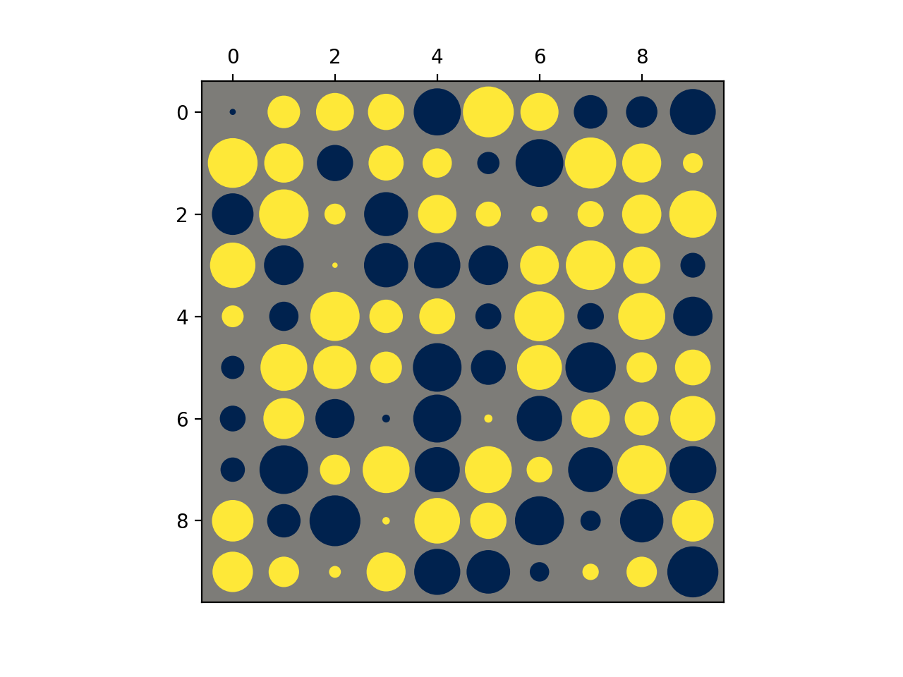
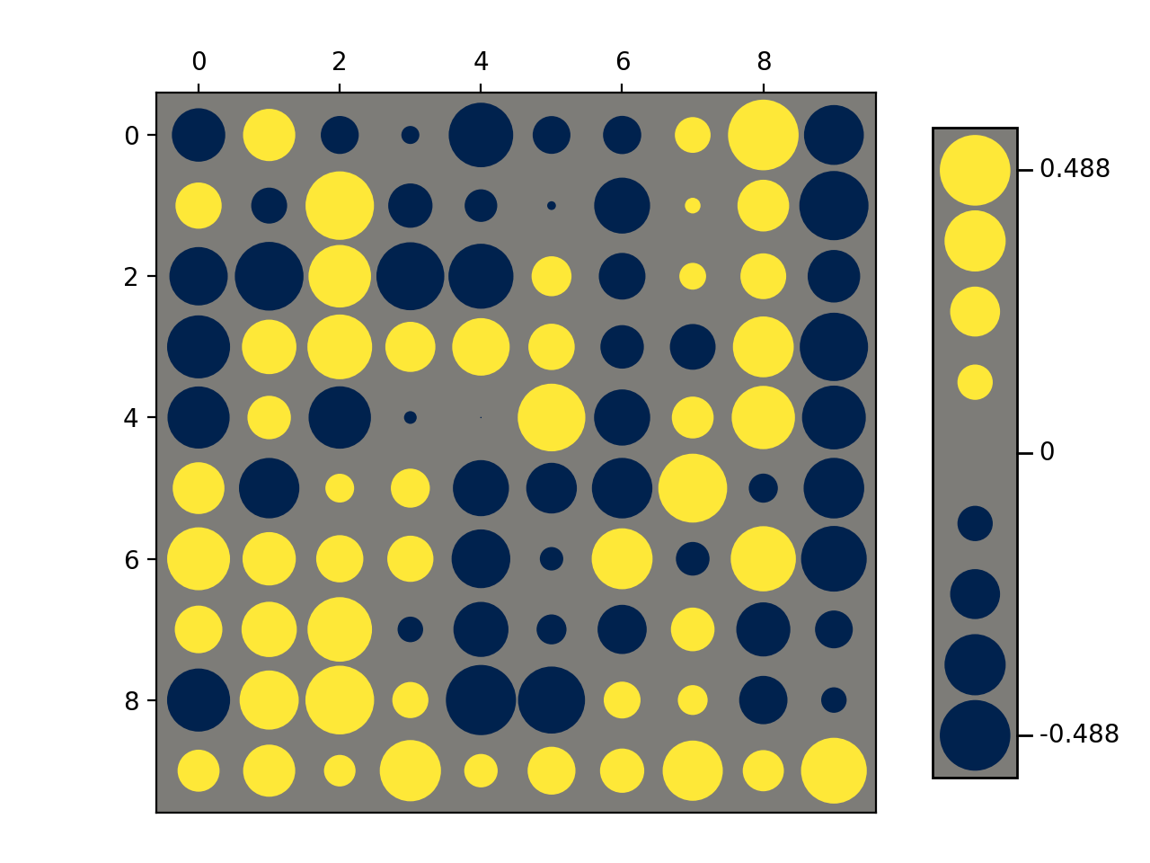
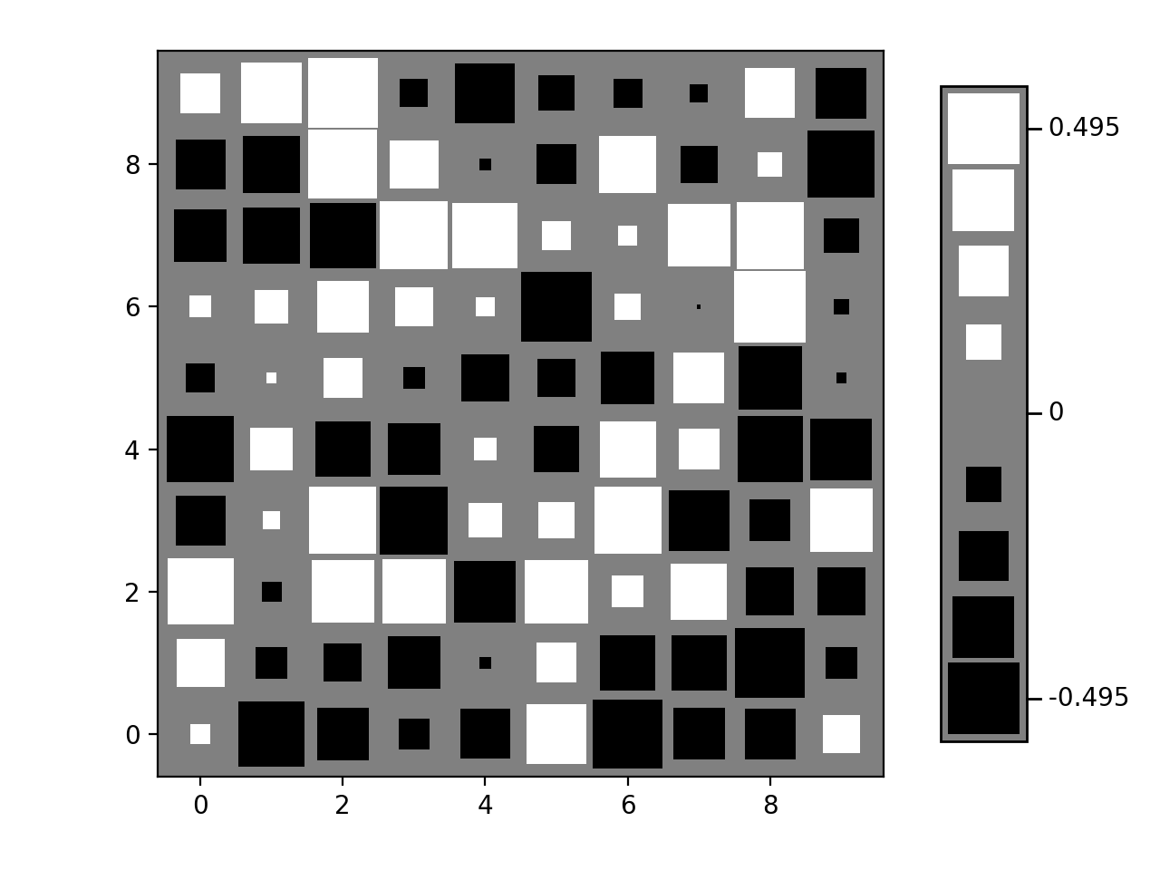
- nustattools.plotting.hinton(matrix, *, vmax=None, shape='circle', origin='upper', cmap='cividis', legend=False, ax=None)[source]
Draw Hinton diagram for visualizing a matrix with positive and negative values.
- Parameters:
matrix (numpy.ndarray) – The matrix to be visualized.
vmax (float, optional) – The upper limit of the value scale. -vmax will be used as the lower limit. Defaults to being inferred from the data.
shape (str, default="circle") – Either “circle” or “square”. The shape of the symbols representing the matrix elements.
origin (str, default="upper") – Either “upper” or “lower”. Where to put the 1st element of the 1st axis.
cmap (str, default="cividis") – The Matplotlib colormap to take the colors from. Should be perceptually uniform sequantial.
legend (bool, default=False) – Draw a “legend” to the side of the plot, showing the range of values.
ax (matplotlib.axes.Axes, optional) – Axes object to plot onto
- Returns:
col0, col1 – The collections of patches for the negative and positive colors respectively
- Return type:
Examples
Basic usage:
>>> import numpy as np
>>> from matplotlib import pyplot as plt
>>> from nustattools import plotting as nuplt
>>> rng = np.random.default_rng()
>>> M = rng.uniform(size=(10,10)) - 0.5
>>> nuplt.hinton(M)
(
Source code,png,hires.png,pdf)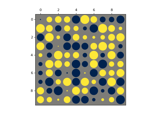
Plot with a legend:
>>> import numpy as np
>>> from matplotlib import pyplot as plt
>>> from nustattools import plotting as nuplt
>>> rng = np.random.default_rng()
>>> M = rng.uniform(size=(10,10)) - 0.5
>>> nuplt.hinton(M, legend=True)
>>> plt.tight_layout(pad=2)
(
Source code,png,hires.png,pdf)
Variants:
>>> import numpy as np
>>> from matplotlib import pyplot as plt
>>> from nustattools import plotting as nuplt
>>> rng = np.random.default_rng()
>>> M = rng.uniform(size=(10,10)) - 0.5
>>> nuplt.hinton(M, legend=True, shape="square", cmap="gray", origin="lower")
>>> plt.tight_layout(pad=2)
(
Source code,png,hires.png,pdf)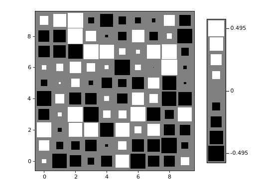
Notes
Based on https://matplotlib.org/stable/gallery/specialty_plots/hinton_demo.html
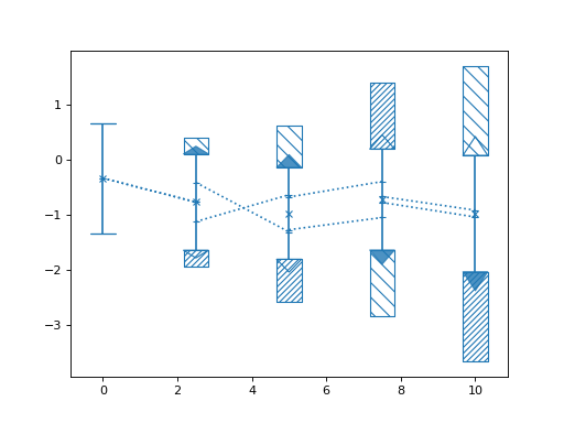
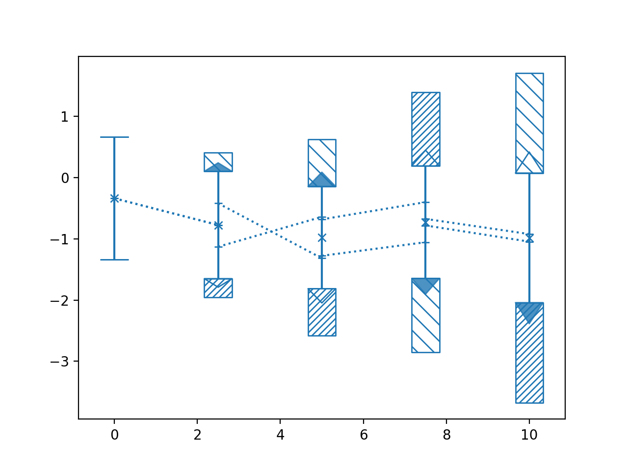
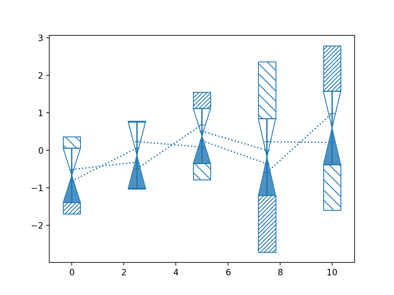
- nustattools.plotting.pcplot(x, y, ycov, *, componentwidth=None, scaling='conditional-mincor', poshatch='/////', neghatch='\\\\\\\\', drawcorlines=True, drawconditional=True, normalize=True, ax=None, return_dict=None, **kwargs)[source]
Plot data points with 1st PCA component and correlation lines.
The contribution of the first principal component is subtracted from the covariance and the remainder plotted with
corlines(). Then the difference to the full covariance matrix is plotted with the type of infill indicating the direction of the first principal component.- Parameters:
x (numpy.ndarray) – The data x and y coordinates to be plotted.
y (numpy.ndarray) – The data x and y coordinates to be plotted.
ycov (numpy.ndarray) – The covariance matrix describing the uncertainties of the y-values. The error bars will correspond the the square root of the diagonal entries.
componentwidth (optional) – The width of the hatched areas indicating the 1st principal component in axes coordinates. Can be a single number, so it is equal for all data points; an iterable of numbers so it is different for each, or an iterable of pairs of numbers, so there is an asymmetric width for each.
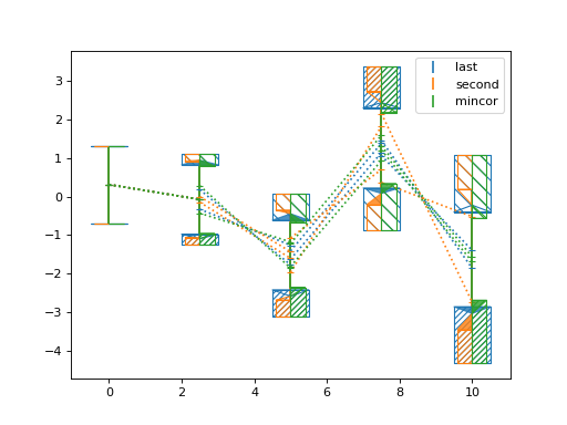
scaling (default="conditional-mincor") – Determines how the length of the first principal component is scaled before removing its contribution from the covariance. If a
float, the contribution is scaled with that value. At 0.0, nothing is removed, at 1.0 the component is removed completely and the remaining covariance’s rank will reduce by 1. See Notes for an explanation of the other options.poshatch (str, optional) – The Matplotlib hatch styles for the positive direction of the first principal component.
neghatch (str, optional) – The Matplotlib hatch styles for the negative direction of the first principal component.
drawcorlines (default=True) – Whether to draw correlation lines of the remaining covariance.
drawconditional (default=True) – Whether to draw the conditional uncertainty of each data point, i.e. the allowed variance if all other points are fixed. The filling of the triangles indicates the direction of the last (smallest) principal component.
normalize (default=True) – If
True, the covariance is scaled such that all diagonals are 1, and the PCA is run on the correlation matrix. IfFalse, the PCA is run on the covariance matrix directly. In the latter case, different error scales for different data points will have a strong influence on the selection of the components.ax (matplotlib.axes.Axes, optional) – Axes object to plot onto
return_dict (dict, optional) – Dictionary to store some of the intermediary steps of the covariance decompositions.
**kwargs (dict, optional) – All other keyword arguments are passed to
corlines()
- Returns:
The return value of the
corlines()function.- Return type:
Notes
This plotting style is most useful for data where the first principal component dominates the covariance of the data and/or there is a single last/lowest principal component that constrains the variation much more than the error bars suggest.
The scaling argument support a couple of modes to automatically determine the desired scaling factor:
"mincor"The component will be scaled such that the overall correlation in the remaining covariance is minimized.
"second"The component will be scaled such that the remaining contribution of the first principal component is equal to the second principal component.
"last"The component will be scaled such that its contribution is equal to the last principal component.
"conditional"The scaling is maximised, while ensuring that the diagonal elements of the remaining covariance are at least as big as the corresponding conditional uncertainties of each bin.
"conditional-mincor"The overall correlation in the remaining covariance is minimized under the same constraints as in the
"conditional"case.
Examples
Basic usage:
>>> import numpy as np
>>> from matplotlib import pyplot as plt
>>> from nustattools import plotting as nuplt
>>> rng = np.random.default_rng()
>>> x = np.linspace(0, 10, 5)
>>> u = x[:,np.newaxis] / 4
>>> u[-2] *= -1
>>> cov = np.eye(5) + u@u.T
>>> y = rng.multivariate_normal(np.zeros(5), cov)
>>> nuplt.pcplot(x, y, cov, marker="x")
(
Source code,png,hires.png,pdf)
Compare scalings:
>>> import numpy as np
>>> from matplotlib import pyplot as plt
>>> from nustattools import plotting as nuplt
>>> rng = np.random.default_rng()
>>> x = np.linspace(0, 10, 5)
>>> u = x[:,np.newaxis] / 4
>>> u[-2] *= -1
>>> cov = np.eye(5) + u@u.T
>>> y = rng.multivariate_normal(np.zeros(5), cov)
>>> nuplt.pcplot(x, y, cov, componentwidth=1, scaling="last", label="last")
>>> nuplt.pcplot(x, y, cov, componentwidth=[(0.4,0)], scaling="second", label="second")
>>> nuplt.pcplot(x, y, cov, componentwidth=[(0,0.4)], scaling="mincor", label="mincor")
>>> plt.legend()
(
Source code,png,hires.png,pdf)
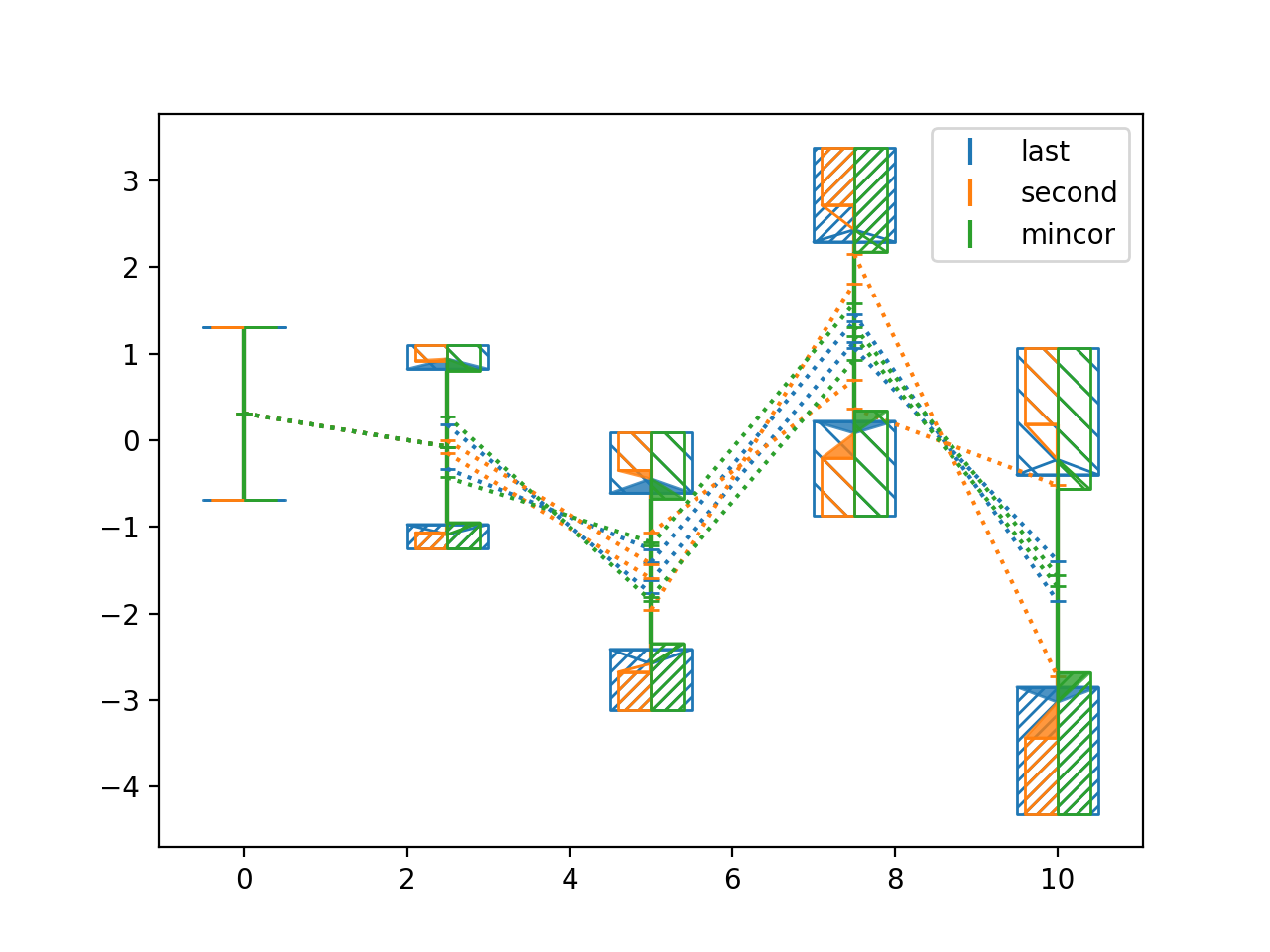
Rank deficient covariance:
>>> import numpy as np
>>> from matplotlib import pyplot as plt
>>> from nustattools import plotting as nuplt
>>> rng = np.random.default_rng()
>>> x = np.linspace(0, 10, 5)
>>> u = x[:,np.newaxis] / 4
>>> u[-2] *= -1
>>> cov = np.eye(5) + u@u.T
>>> # Matrix to project to constant sum of data points
>>> A = np.eye(5) - np.ones((5,5)) * 1/5
>>> cov = A @ cov @ A.T
>>> y = rng.multivariate_normal(np.zeros(5), cov)
>>> nuplt.pcplot(x, y, cov)
(
Source code,png,hires.png,pdf)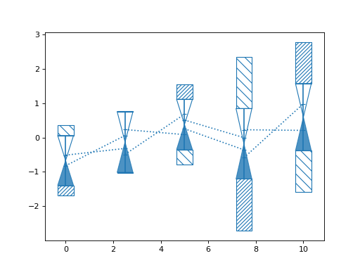
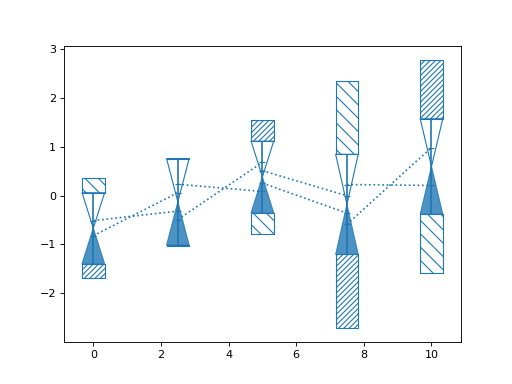
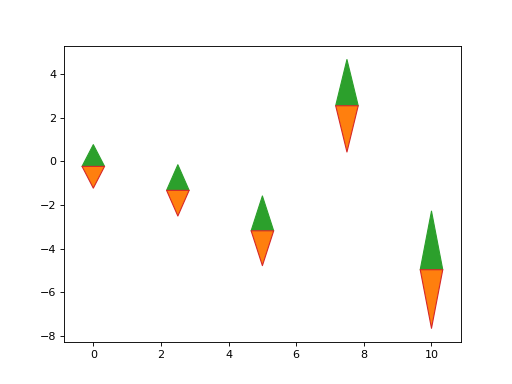
- nustattools.plotting.wedgeplot(x, y, dy, *, wedgewidth=None, ax=None, **kwargs)[source]
Plot vertical wedges at the given data points with the given lengths.
- Parameters:
x (numpy.ndarray) – The data x and y coordinates and length of the wedges to be plotted.
y (numpy.ndarray) – The data x and y coordinates and length of the wedges to be plotted.
dy (numpy.ndarray) – The data x and y coordinates and length of the wedges to be plotted.
wedgewidth (optional) – The width of the wedges in axes coordinates. Can be a single number, so it is equal for all data points; an iterable of numbers so it is different for each, or an iterable of pairs of numbers, so there is an asymmetric width for each.
ax (matplotlib.axes.Axes, optional) – Axes object to plot onto
**kwargs (dict, optional) – All other keyword arguments are passed to
matplotlib.collections.PolyCollection
- Return type:
Examples
Basic usage:
>>> import numpy as np
>>> from matplotlib import pyplot as plt
>>> from nustattools import plotting as nuplt
>>> rng = np.random.default_rng()
>>> x = np.linspace(0, 10, 5)
>>> u = x[:,np.newaxis] / 4
>>> u[-2] *= -1
>>> cov = np.eye(5) + u@u.T
>>> err = np.sqrt(np.diag(cov))
>>> y = rng.multivariate_normal(np.zeros(5), cov)
>>> up = nuplt.wedgeplot(x, y, err, color="C2")
>>> down = nuplt.wedgeplot(x, y, -err, color="C3")
>>> down.set_facecolor("C1")
(
Source code,png,hires.png,pdf)