nustattools.plotting package
Module contents
Copyright (c) 2024 Lukas Koch. All rights reserved.
Potentially useful statistical tools that are not available in scipy.stats.
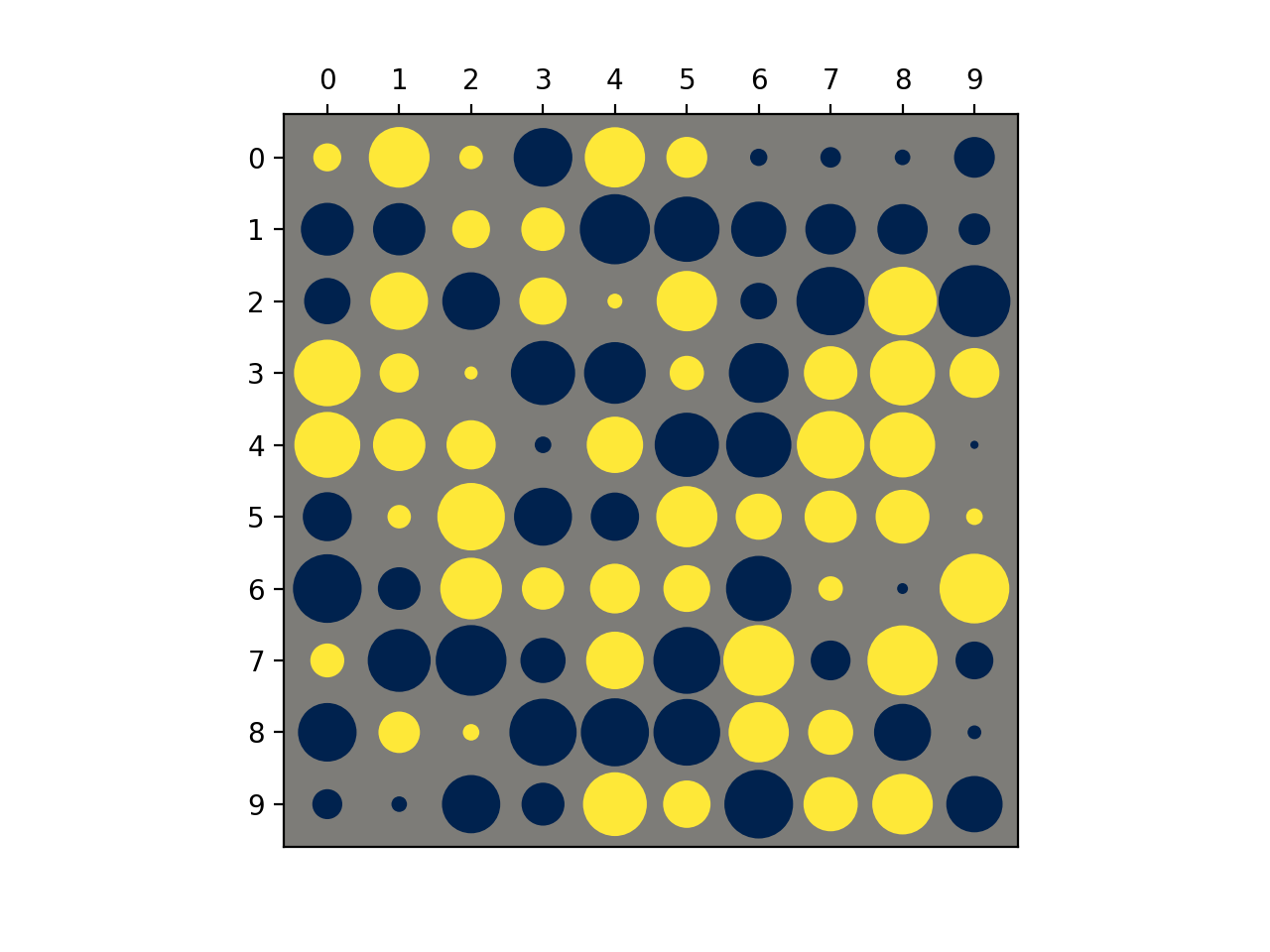
- nustattools.plotting.hinton(matrix, *, vmax=None, shape='circle', origin='upper', cmap='cividis', legend=False, ax=None)[source]
Draw Hinton diagram for visualizing a matrix with positive and negative values.
- Parameters:
matrix (numpy.ndarray) – The matrix to be visualized.
vmax (float, optional) – The upper limit of the value scale. -vmax will be used as the lower limit. Defaults to being inferred from the data.
shape (str, default="circle") – Either “circle” or “square”. The shape of the symbols representing the matrix elements.
origin (str, default="upper") – Either “upper” or “lower”. Where to put the 1st element of the 1st axis.
cmap (str, default="cividis") – The Matplotlib colormap to take the colors from. Should be perceptually uniform sequantial.
legend (bool, default=False) – Draw a “legend” to the side of the plot, showing the range of values.
ax (matplotlib.axes.Axes, optional) – Axes object to plot onto
- Returns:
col0, col1 – The collections of patches for the negative and positive colors respectively
- Return type:
Examples
Basic usage:
>>> import numpy as np
>>> from matplotlib import pyplot as plt
>>> from nustattools import plotting as nuplt
>>> rng = np.random.default_rng()
>>> M = rng.uniform(size=(10,10)) - 0.5
>>> nuplt.hinton(M)
(
Source code,png,hires.png,pdf)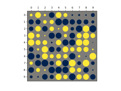
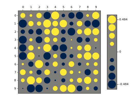
Plot with a legend:
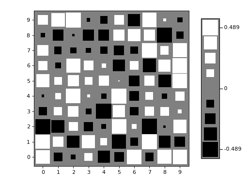
>>> import numpy as np
>>> from matplotlib import pyplot as plt
>>> from nustattools import plotting as nuplt
>>> rng = np.random.default_rng()
>>> M = rng.uniform(size=(10,10)) - 0.5
>>> nuplt.hinton(M, legend=True)
>>> plt.tight_layout(pad=2)
(
Source code,png,hires.png,pdf)
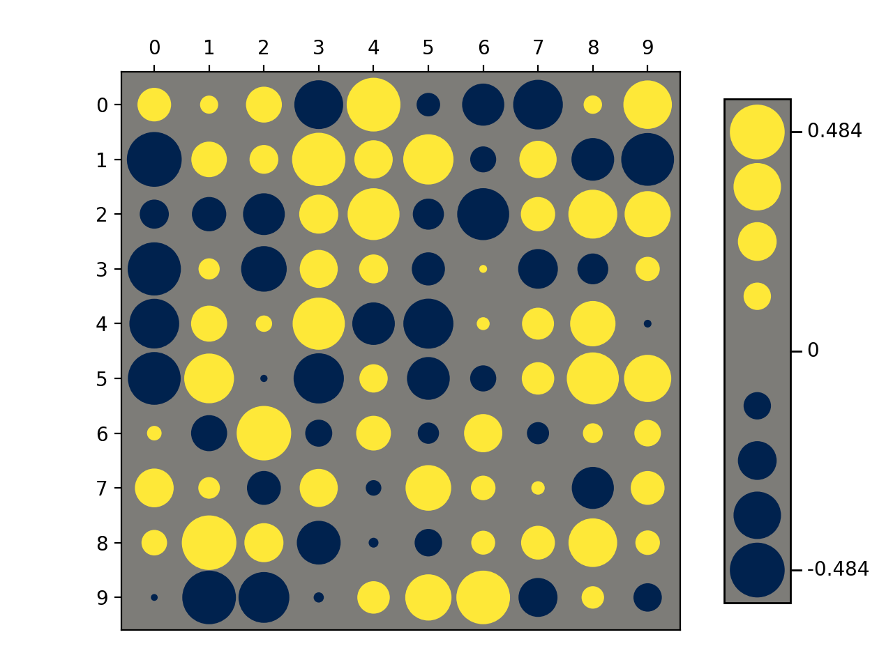
Variants:
>>> import numpy as np
>>> from matplotlib import pyplot as plt
>>> from nustattools import plotting as nuplt
>>> rng = np.random.default_rng()
>>> M = rng.uniform(size=(10,10)) - 0.5
>>> nuplt.hinton(M, legend=True, shape="square", cmap="gray", origin="lower")
>>> plt.tight_layout(pad=2)
(
Source code,png,hires.png,pdf)
Notes
Based on https://matplotlib.org/stable/gallery/specialty_plots/hinton_demo.html